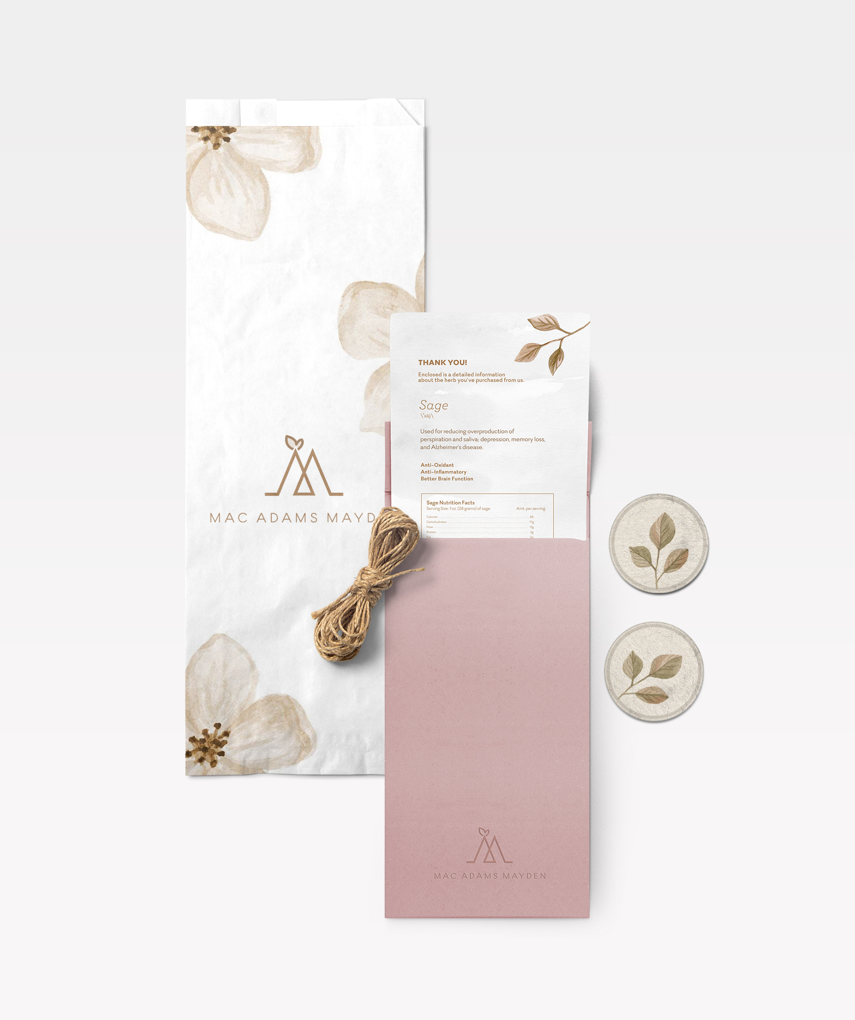
A family business centered around flowers and herbs that has been around for generations
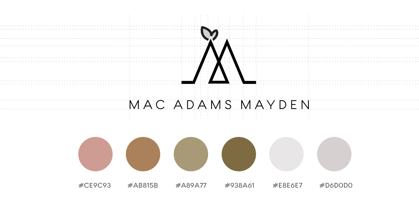
Logo + Print + Web
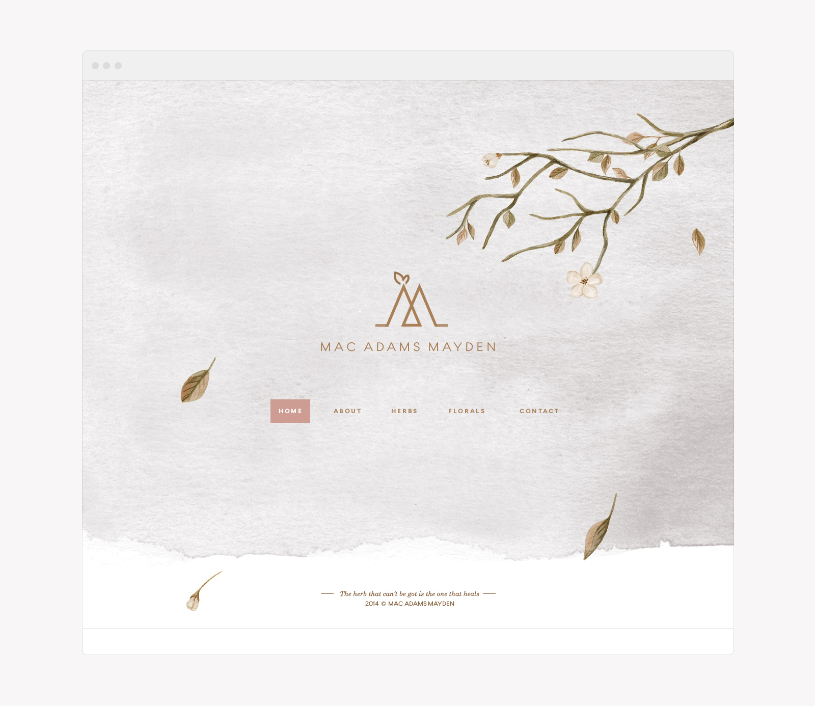
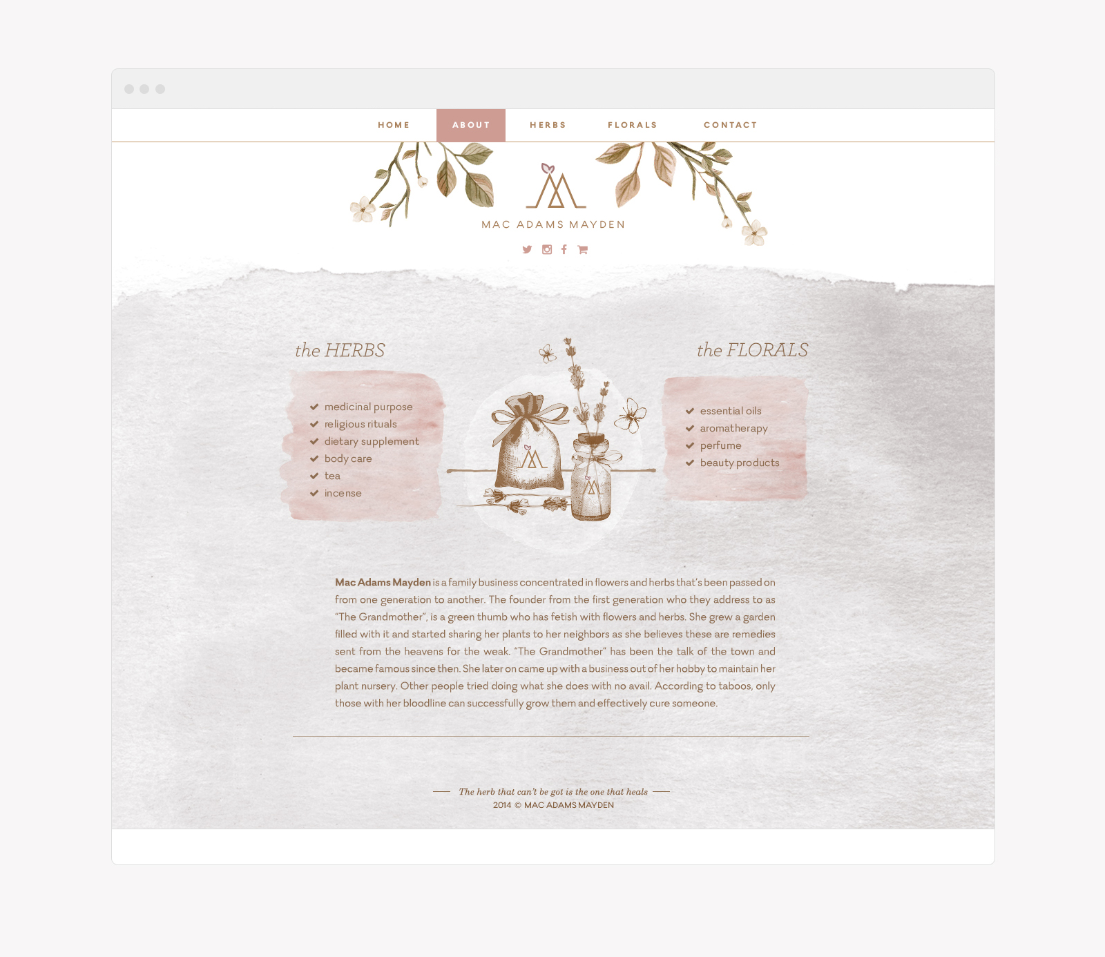
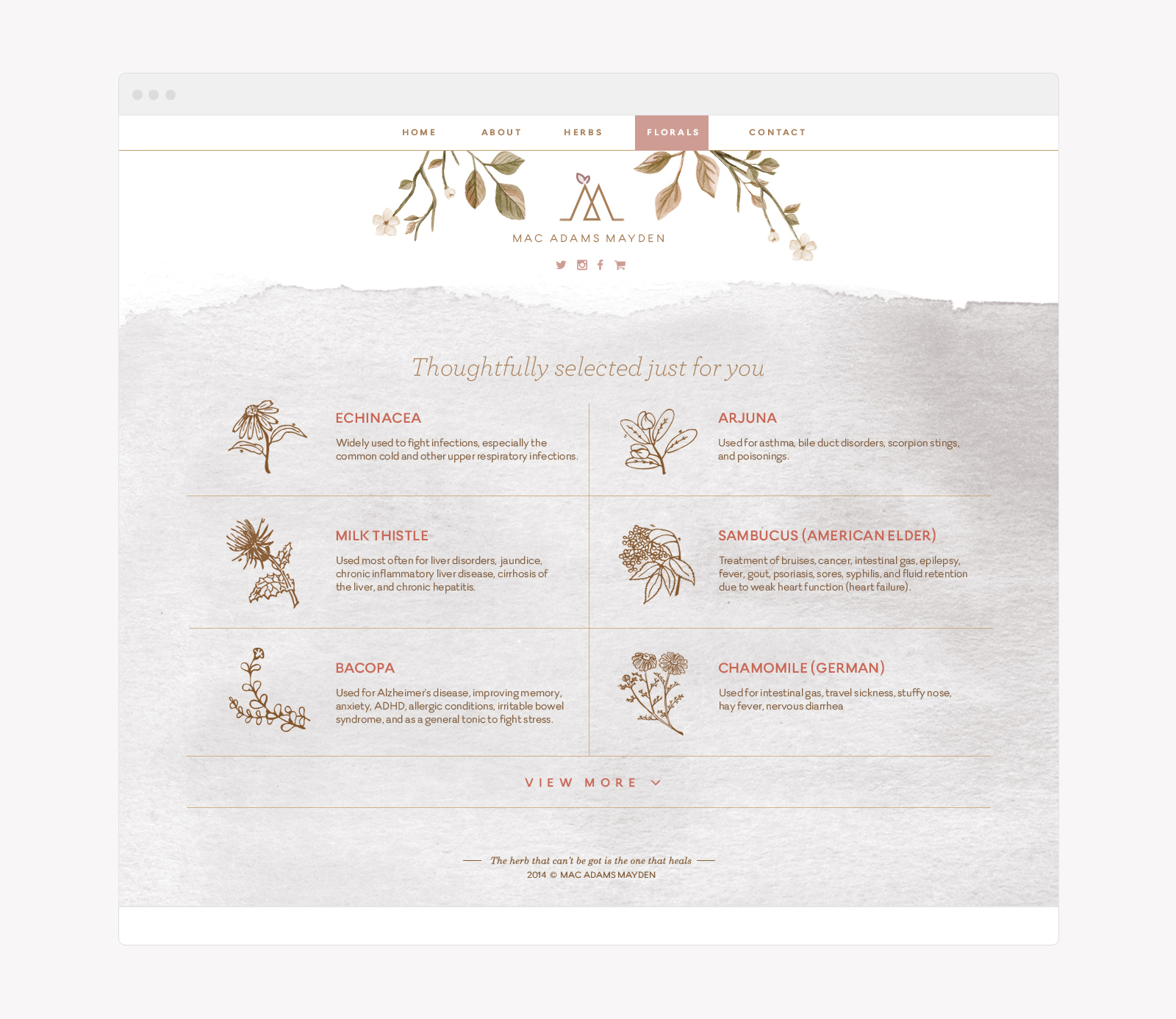
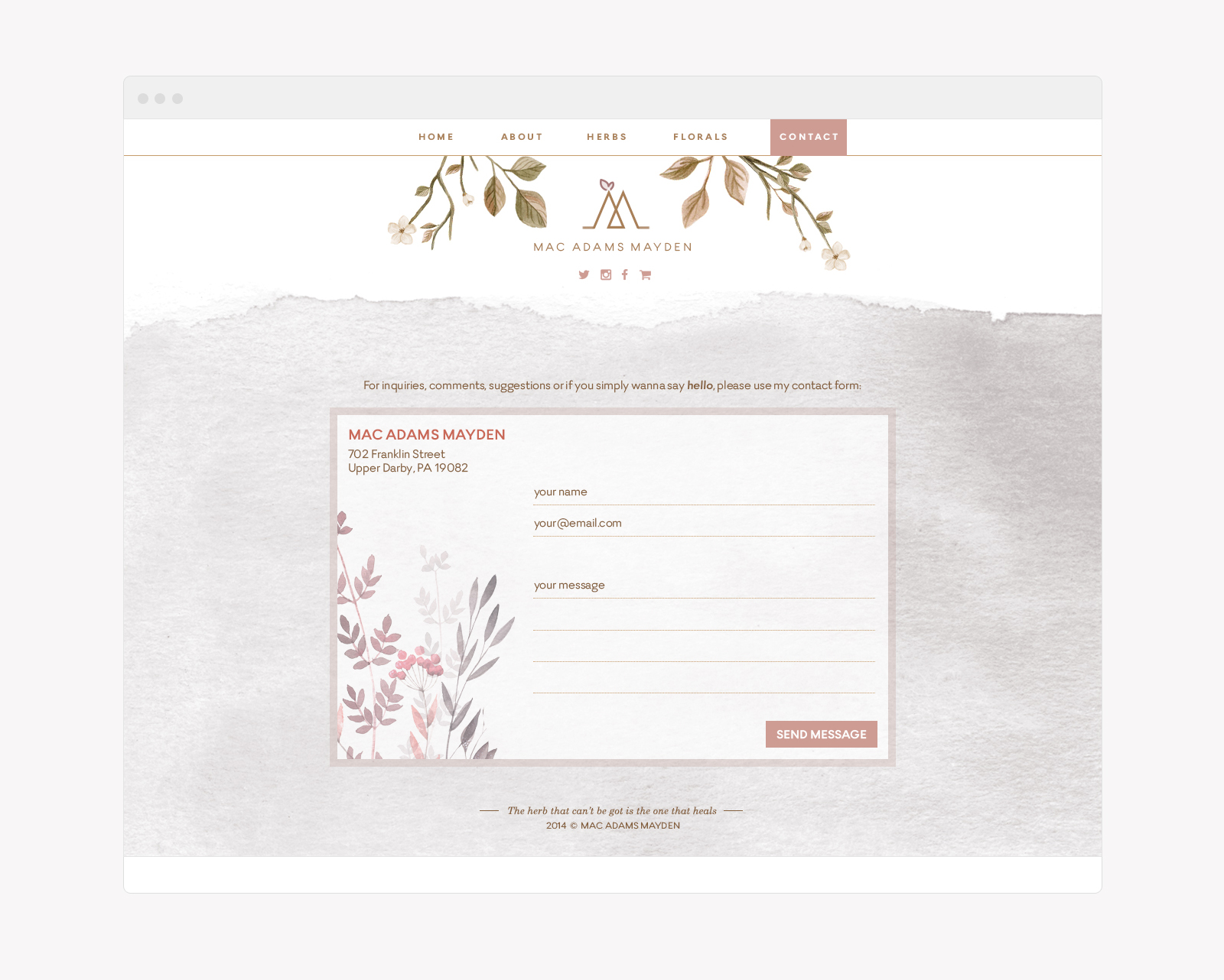
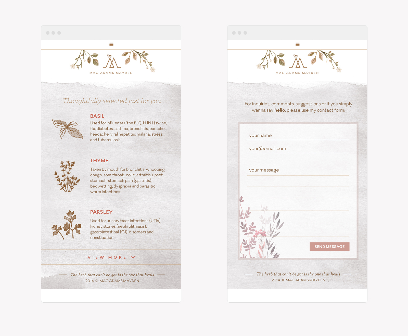
Client’s Notes: Simple and minimal logo. Use light coloured tones. No decent product images to provide but feel free to use stock photos. Don’t make it image heavy. Add a personal touch to it, either print or web.
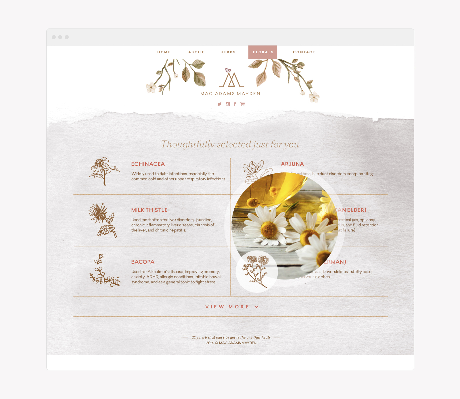
Art Direction: As an alternative to stock images, I decided to use illustrations with water-colour based textures to it. Actual images can be shown via hover (or something like that) so it won’t look too overt. I showed the client my proposed palettes and somehow the grey and light pink pastel combo were liked the most. As for the personal touch, I proposed a note where buyers get to receive a thank you card followed by the important details that will be beneficial to their health regarding the product they’ve purchased. It doesn’t only display the information, it also shows that the brand cares.