A small restaurant that serves Asian food
Logo + Print + App UI/UX
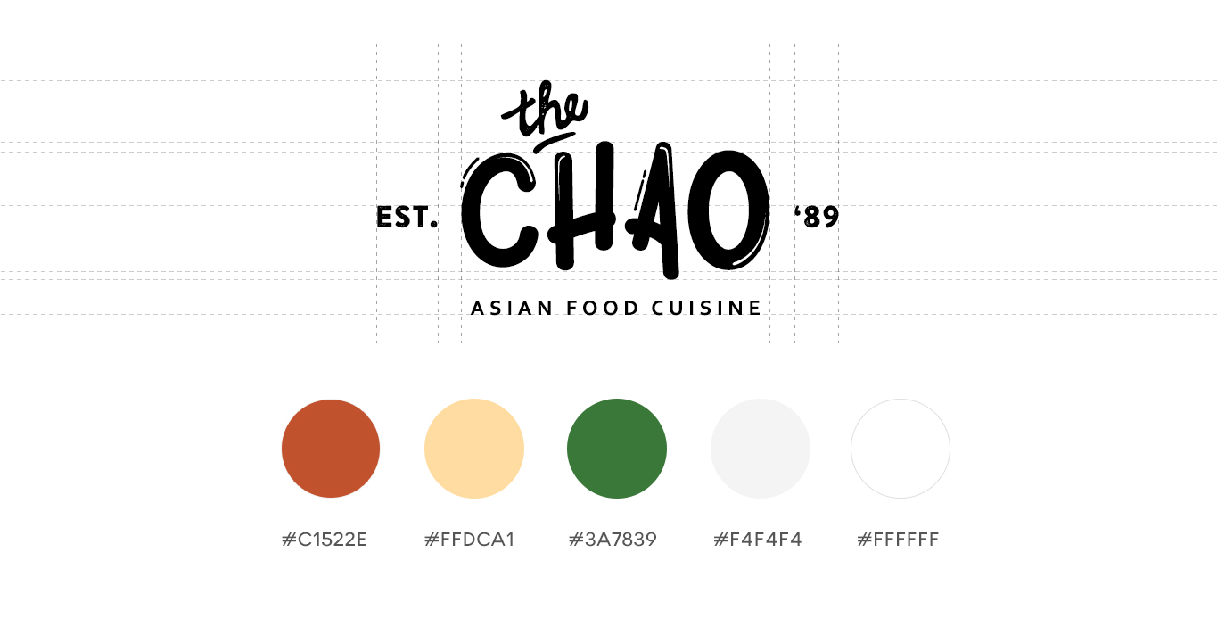
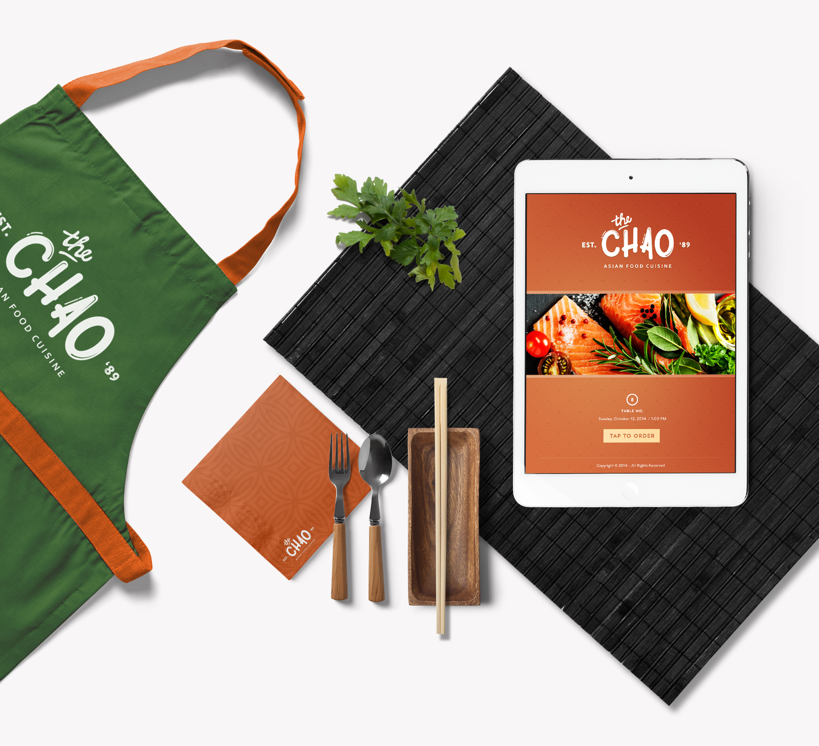
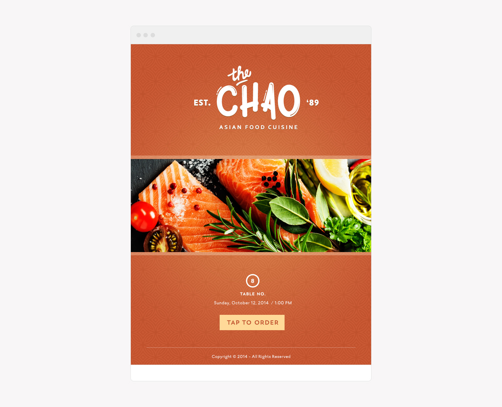
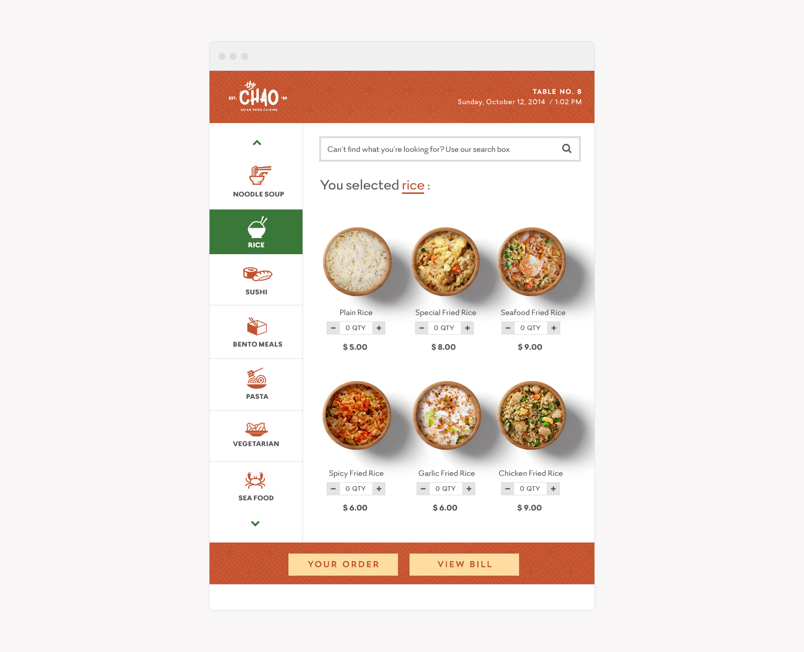
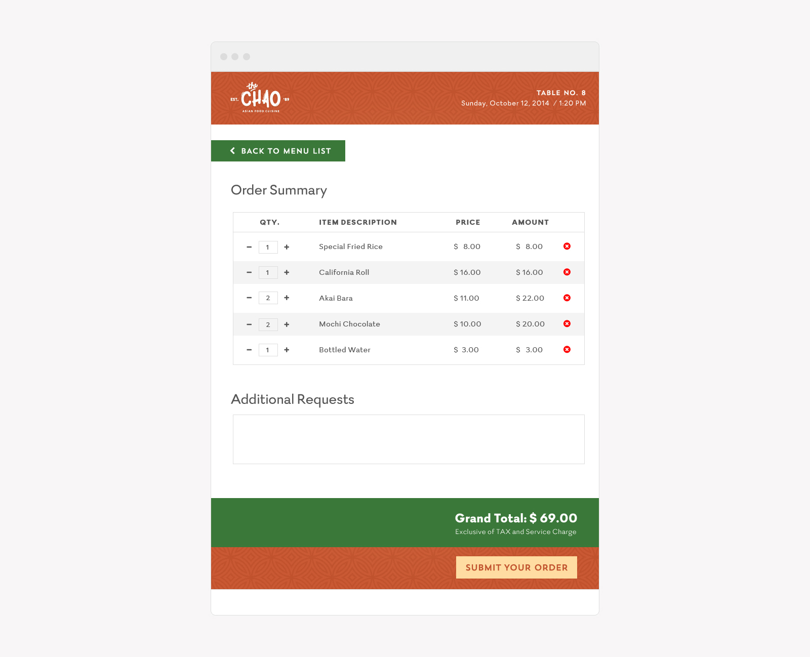
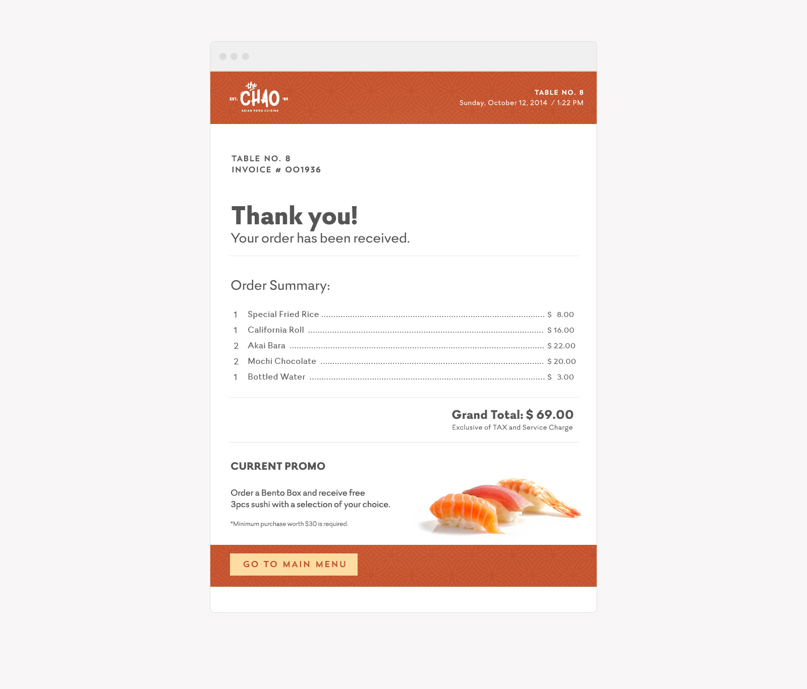
Client’s Notes: Rebrand the existing logo into a less serious tone. Change red and white colors to something vibrant like orange. Introduce an interactive menu as an alternative to the current ordering system due to lack of waiters to serve customers.
Art Direction: Since their business is established decades ago, I tried to come up with a vintage feel for their logo while still considering the fun vibe to it. I proposed orange and green as the main color because the client is leaning towards orange while green simply signifies freshness — something that’s very important when it comes to food.
