Everything organic, made especially for your dear pets’ fun bath time
Logo + Print + Web
Client’s Notes: No text-based kind of logo so play with different objects to come up with a distinct style but make sure it still looks clean. Nothing too conceptual but not too plain. Don’t use serif fonts as much as possible, would personally like a thin font to spell out the brand’s name on top of your proposed visual logo. Find a perfect match for the existing neon green color but please nothing too dark. Make it a happy color. Work on the hero master visual and see which of the assets provided will work or not. For the website, make it dynamic if not interactive.
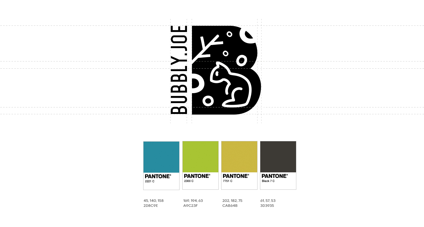
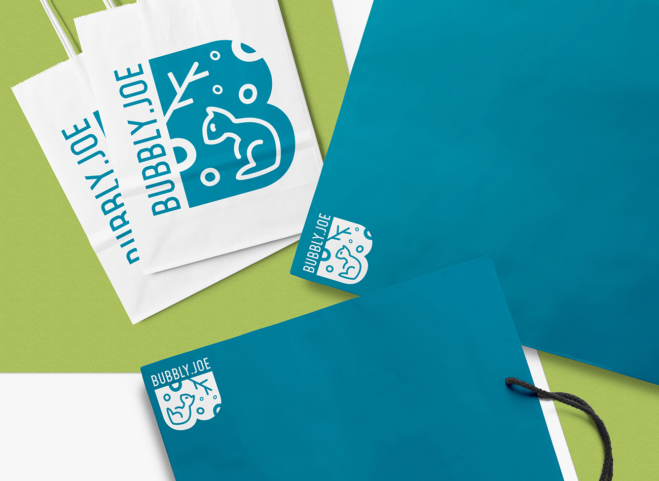
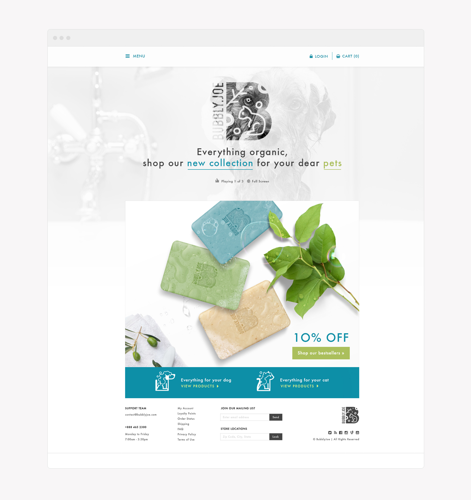
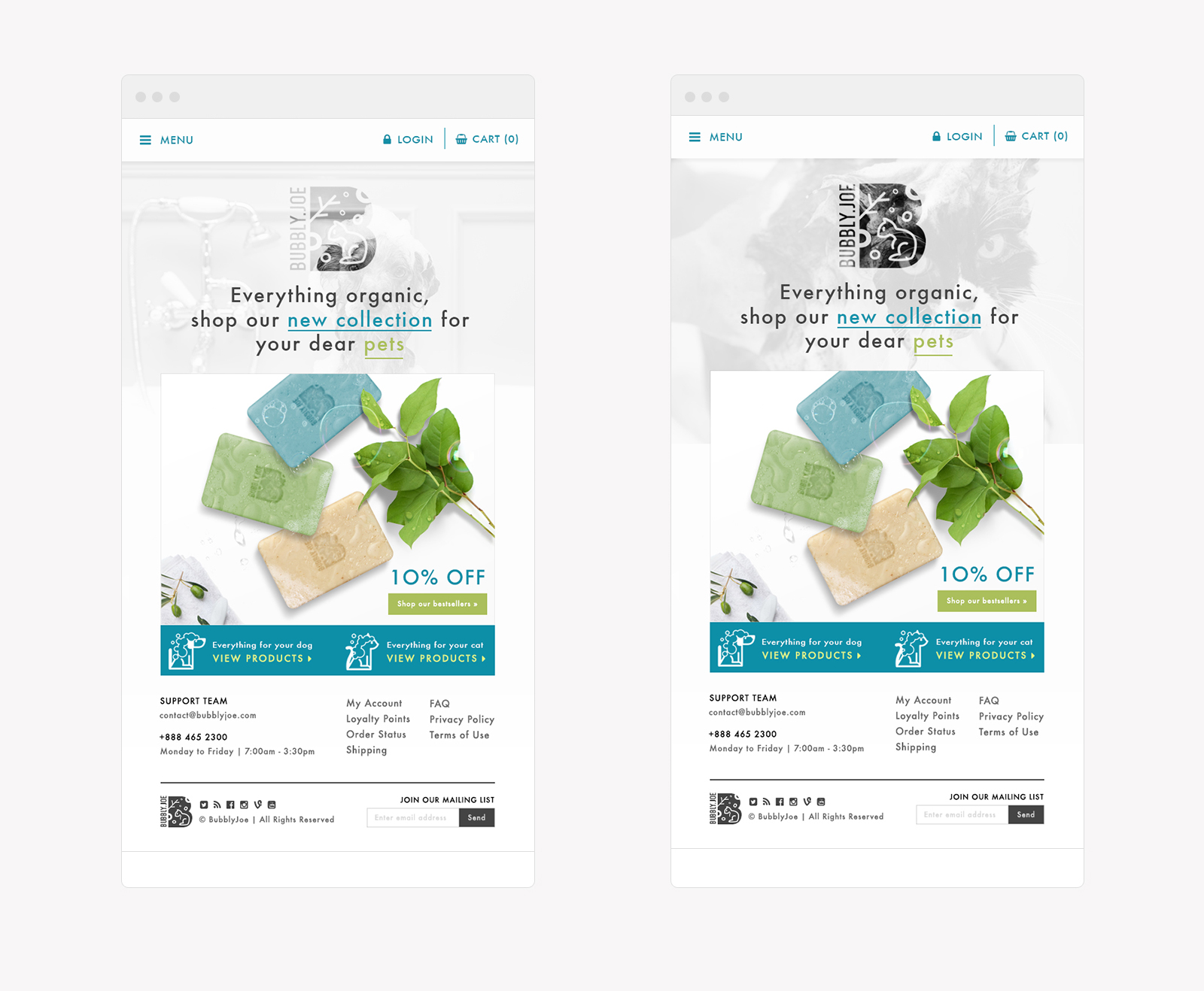
Art Direction: For the logo, I made use of bubbles, wood and pet to come up with a visual that presents the product. Bubbles = soap, wood = organic and pet = Joe. I tried to convey a visual that will make people have a second look on what the logo is all about. Though it’s not “that” conceptual, it’s something that will make you think of a story by just looking at it. The best happy color that would complement the existing neon green for me is this bright blue (close to bubblegum blue) which the client highly approved of. For the website, I embedded a video of pets having a bath with an overlay clipped logo on it to give a see-through effect on it.
