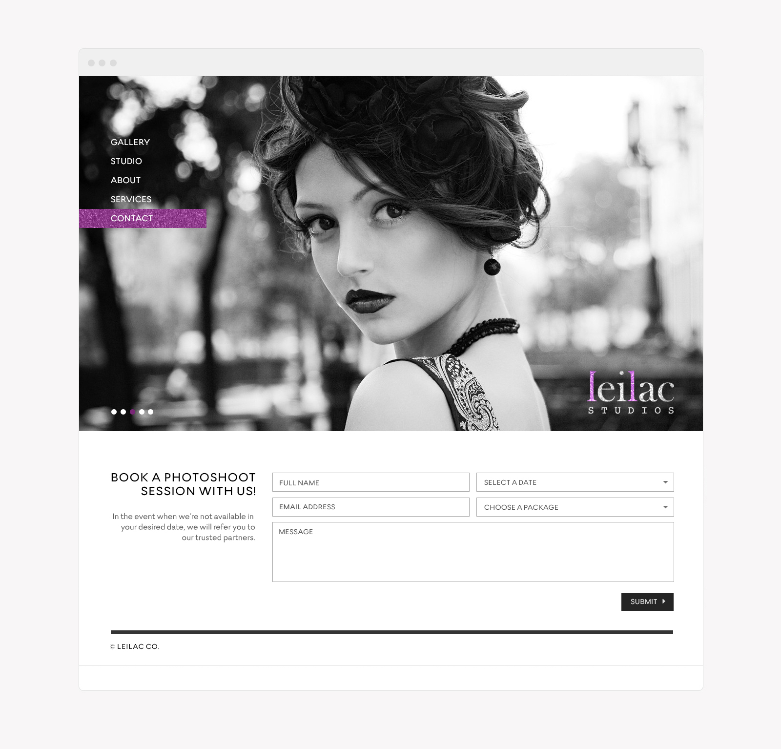
Photos that capture moments. Photos that reflect the best version of you.
Logo + Print + Web
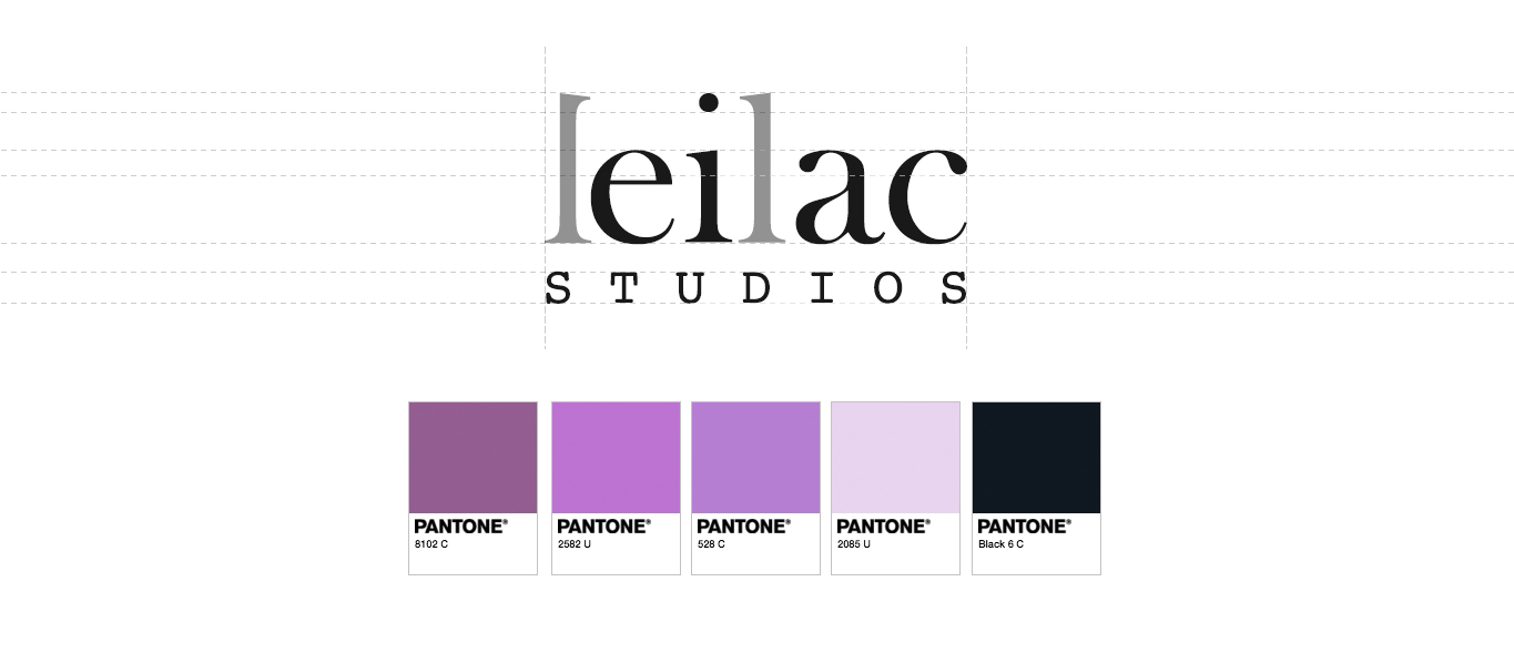
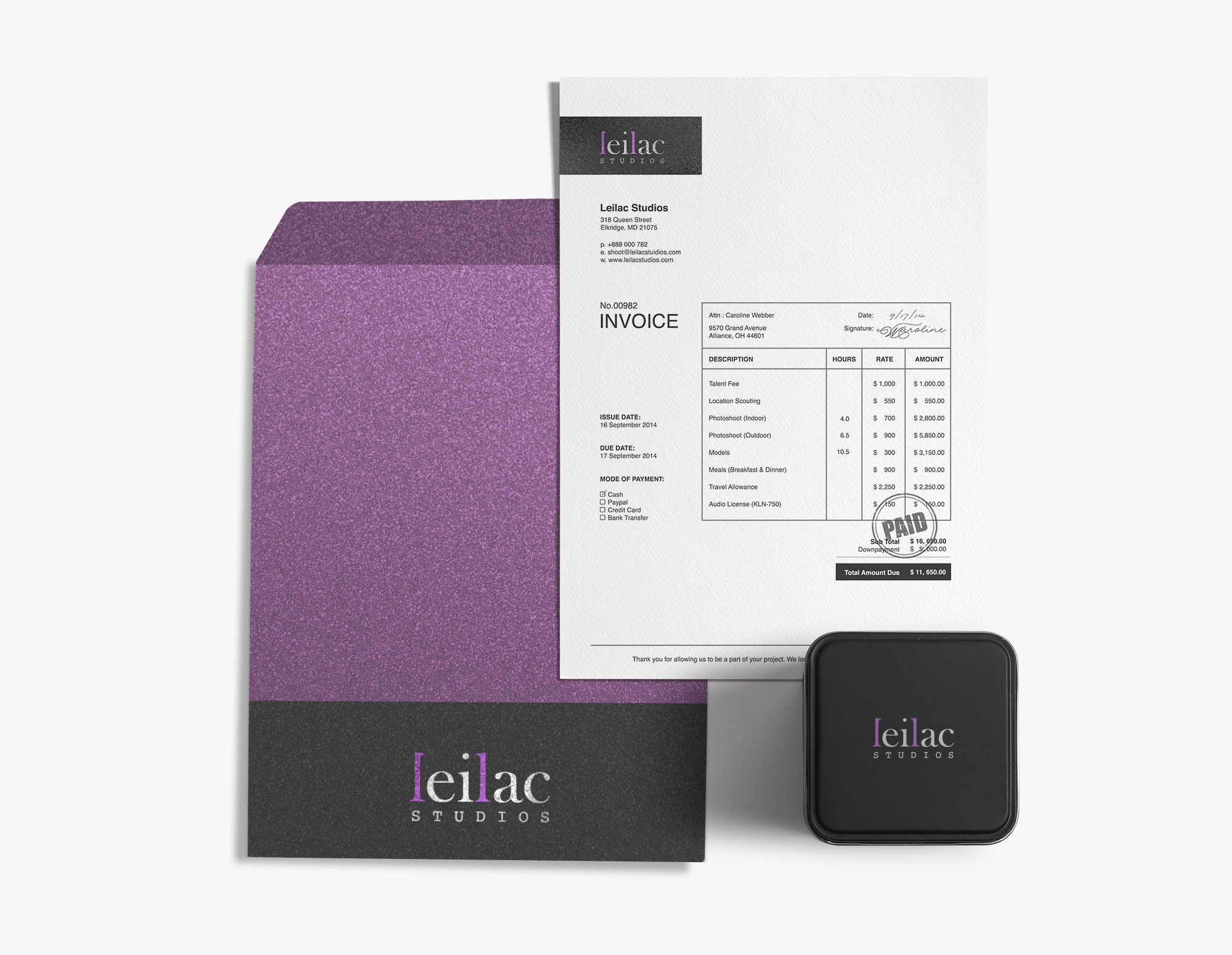
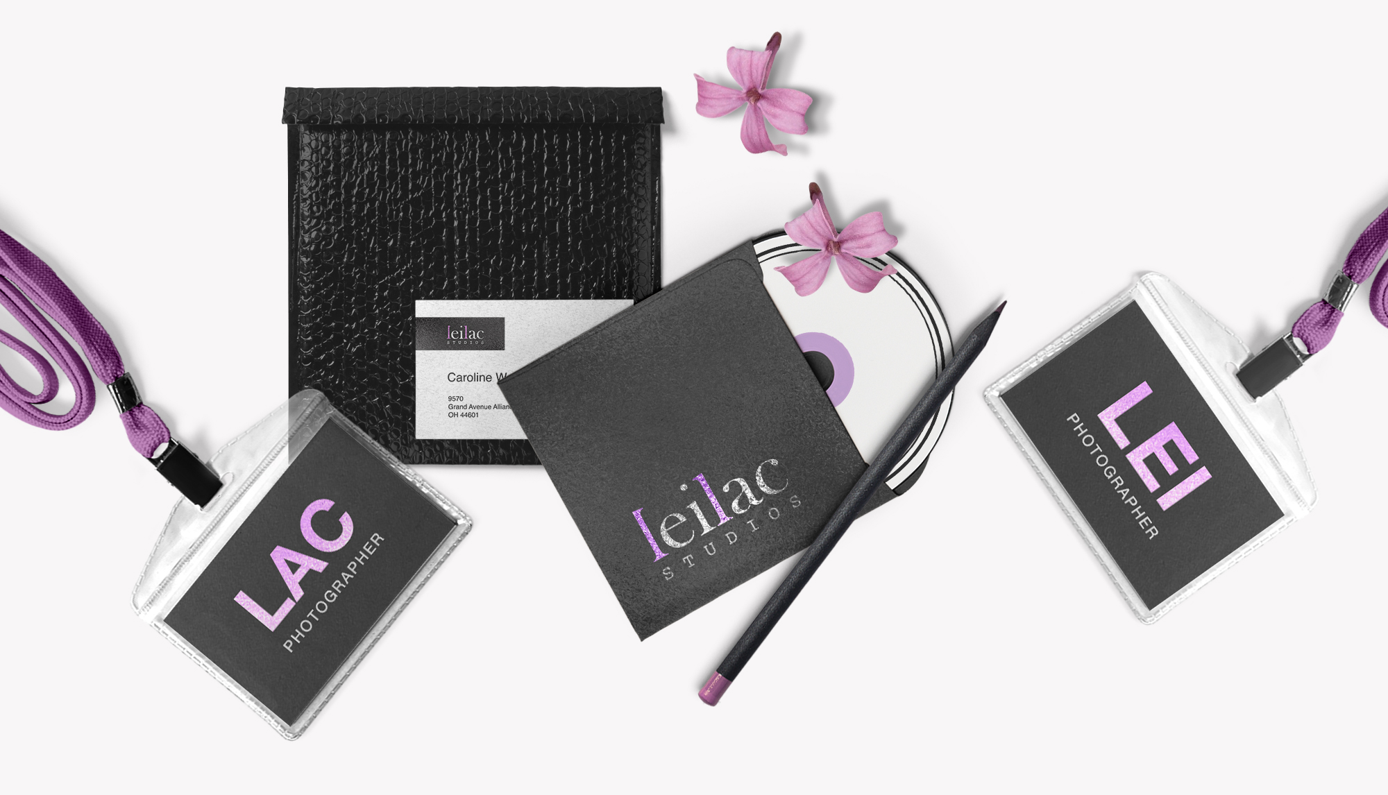
Client’s Notes: Lei and Lac have different personalities but both have a common denominator — they like glitter. The previous branding for LeiLac looked too attention seeking. This time, it has to look fancy and glittery yet very sophisticated. Consider that it should have a corporate tone but not too boring.
Art Direction: When I was told that it has to be glittery and flashy but corporate at the same time, I had a hard time blending the two. Thanks to different paper stocks’ styles and textures, I was able to come up with something. Lei and Lac are very vocal about how they don’t want to make it look too masculine by imposing certain elements to be filtered out on my design drafts. After some rounds of revision, we settled with a serif font that has symmetrical twinning with their first letter names. Colors I’ve chosen for their brand is similar to the color of the flower lilac, coupled by black to give a corporate feel to it.