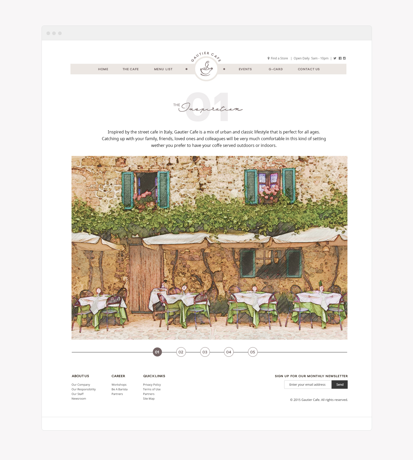
Inspired by the street cafe in Italy, Gautier Cafe is a mix of urban and classic style for all ages
Logo + Web
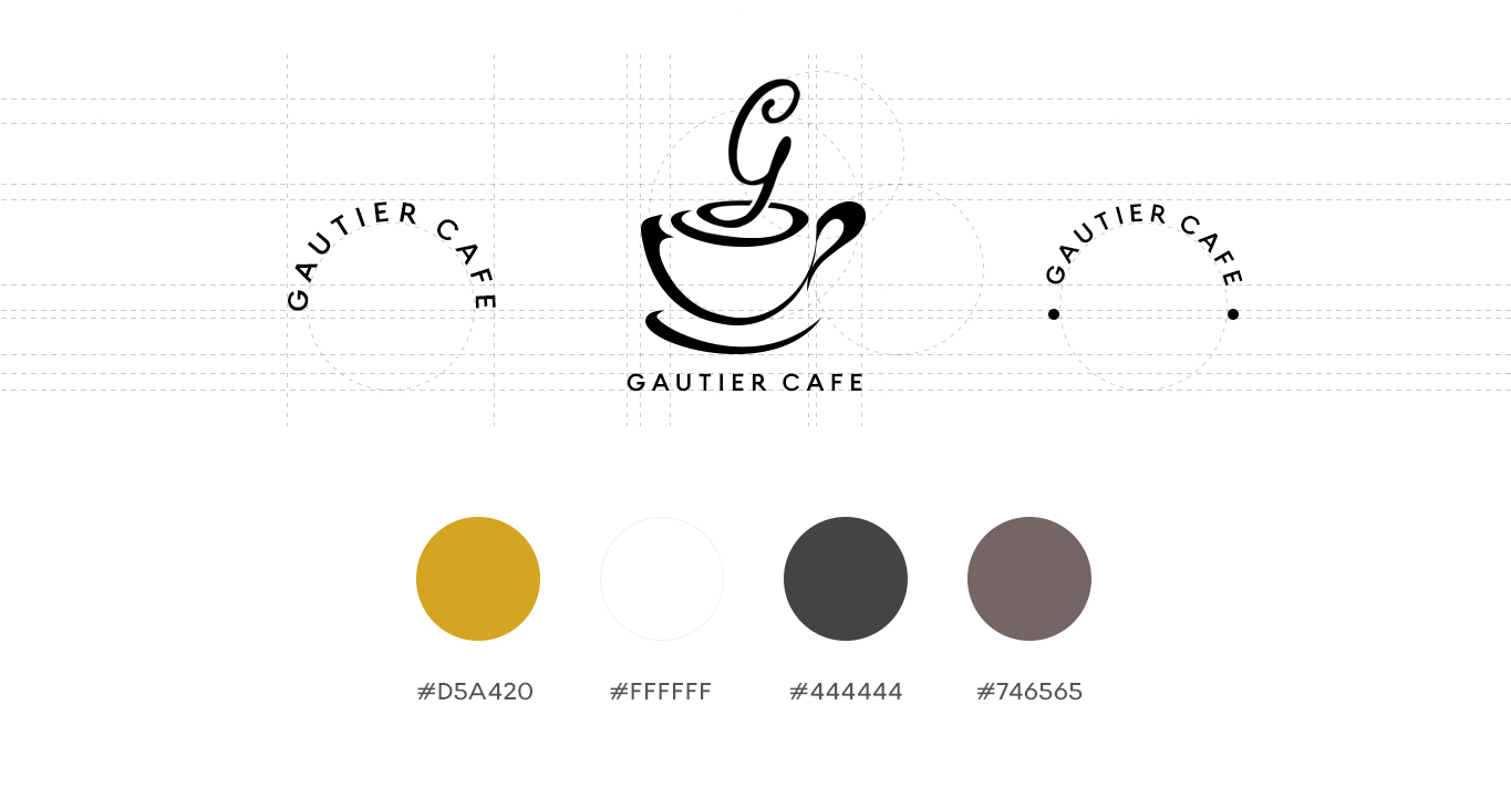
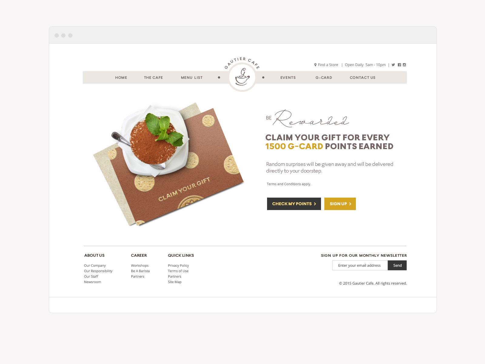
Client’s Notes: Layout has to be something cute but not too cute. Neat and minimalistic with bright colours. Aside from the top menu, there has to be quick links at the bottom part of the layout too. Not a fan of sliding images in the homepage so just use a huge banner with promos + CTA. When curating the logo, be playful with the ‘G’ letter above everything else.
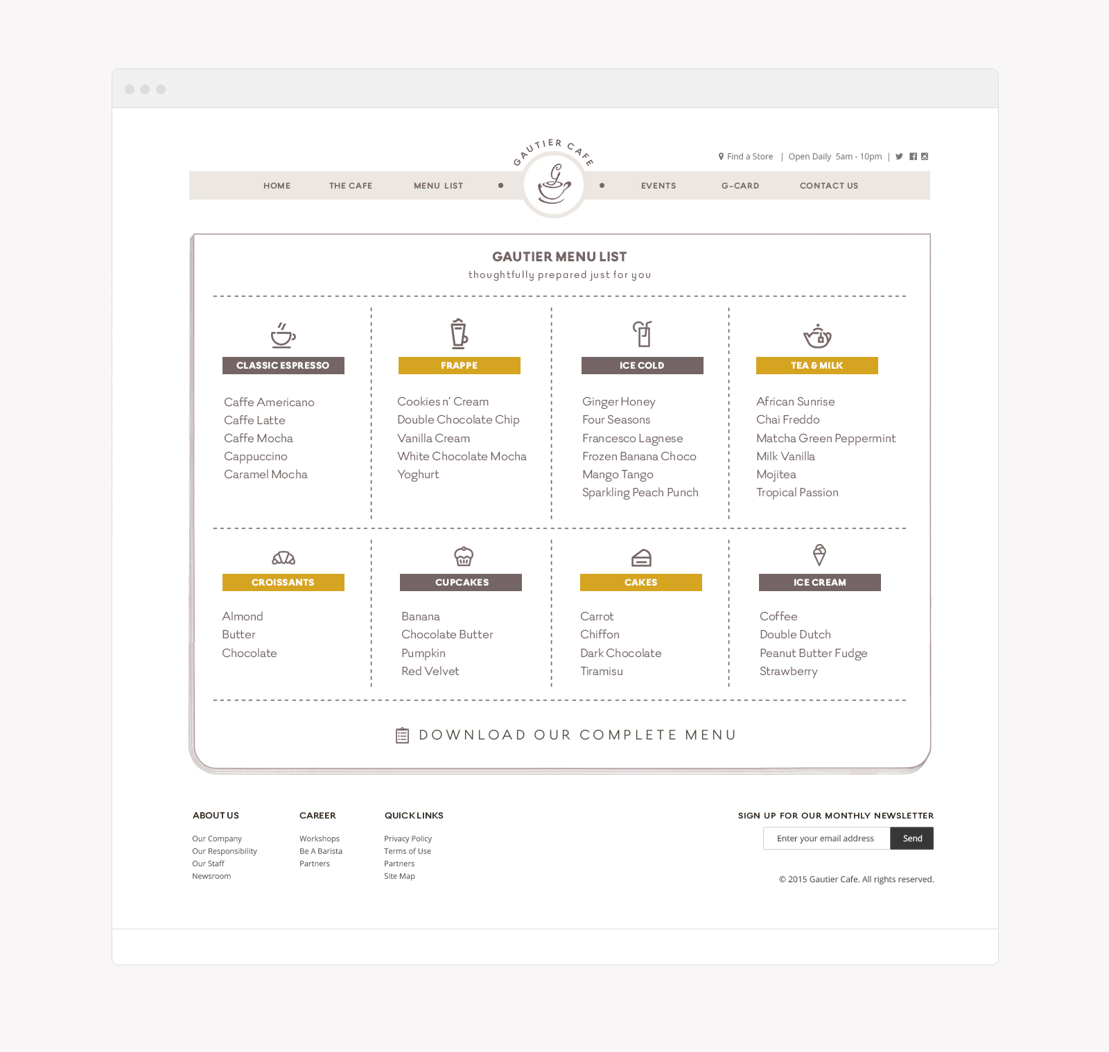
Art Direction: Playing with letter ‘G’ is the tricky part in curating the logo and the client has been very specific when it comes to where it should come to play. Though the client’s direction is looking too cliché for me, we somewhat met in the middle where we’re both happy with the outcome. Colors used resembles a light shaded coffee with gold yellow as its accent color. To achieve a cute feel in the layout, I proposed a customized menu with cute icons on it. This was later on adapted to print.


