‘Friday shots’ or whatever, drinks on us!
Logo + Print + eDM
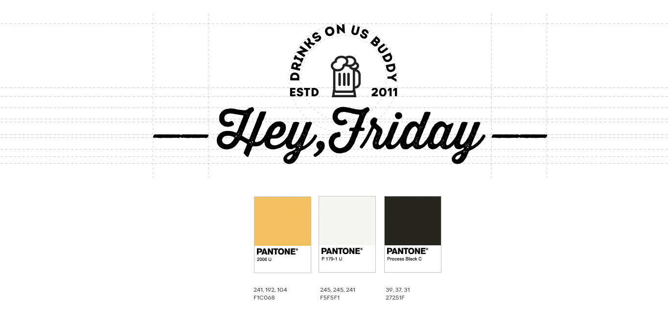
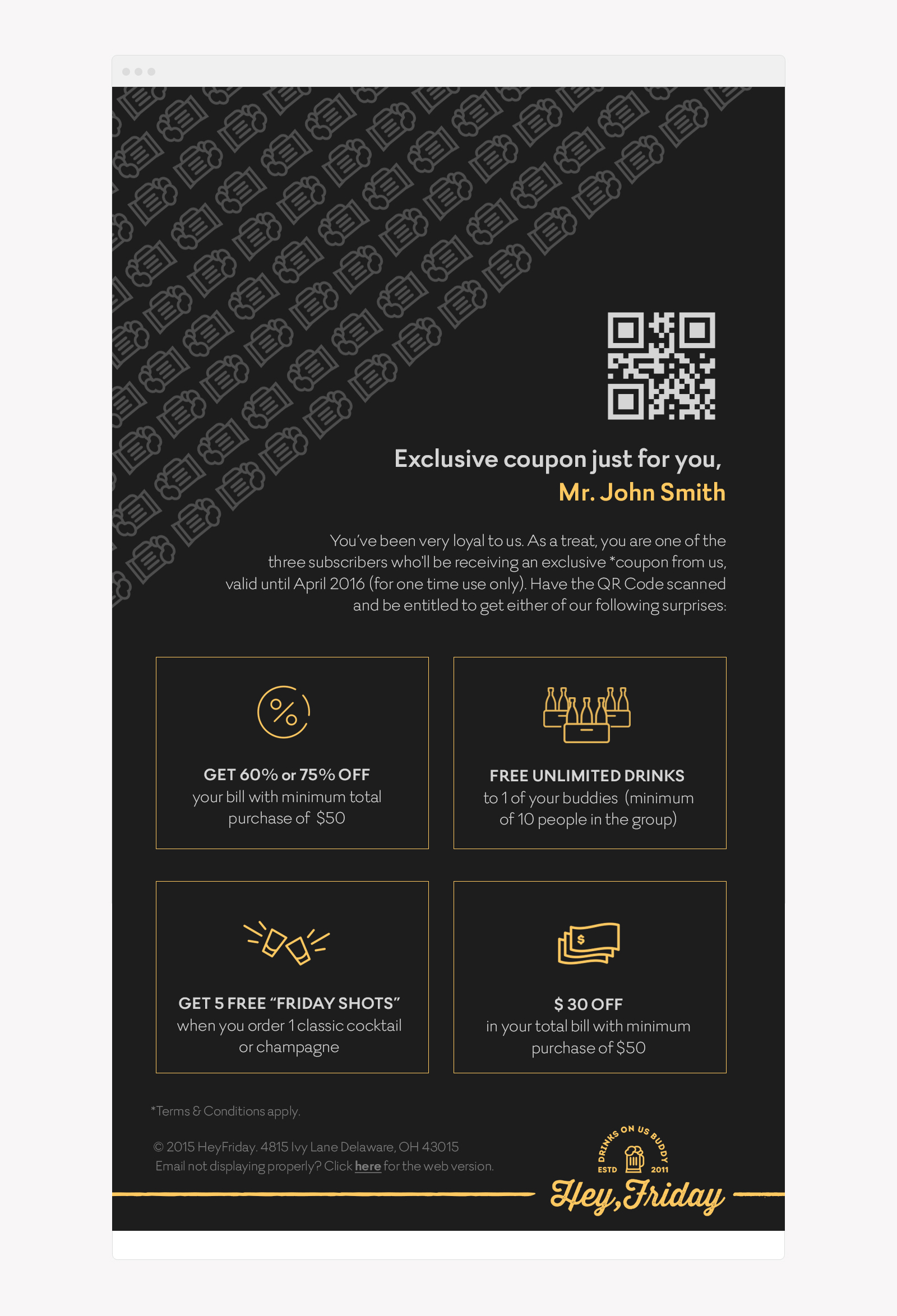
Client’s Notes: Usually when people think of alcohol, it’s always the bright lights and sexy girls. But for Hey Friday, that notion is dropped. Please propose a branding/identity that will show this is a place to have a good time without having daring displays or visuals to advertise it. Ideally, this place is suited for business settings/pros or even friends who want to have a decent place to share drinks with. The logo has to be very straight-forward but not plain. A badge style is ideal but not too intricate. If possible, include a vintage feel to it. Colors should be general and would appease both genders. Create email newsletters to promote Hey Friday promos. A kind of email where the receiver would feel it’s really meant for them and not some general email blast sent to all subscribers.
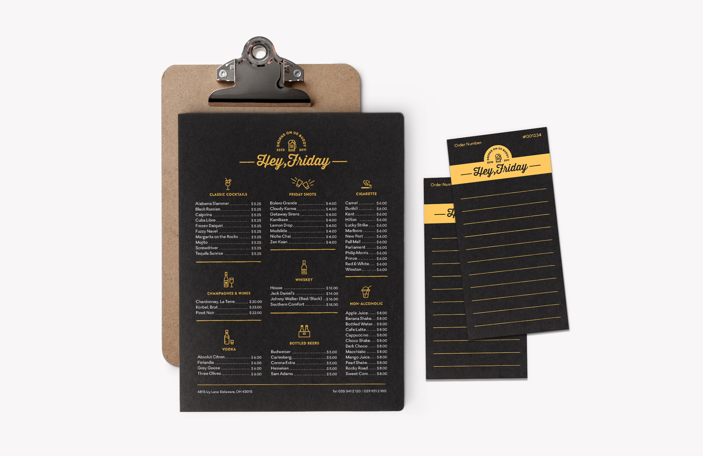
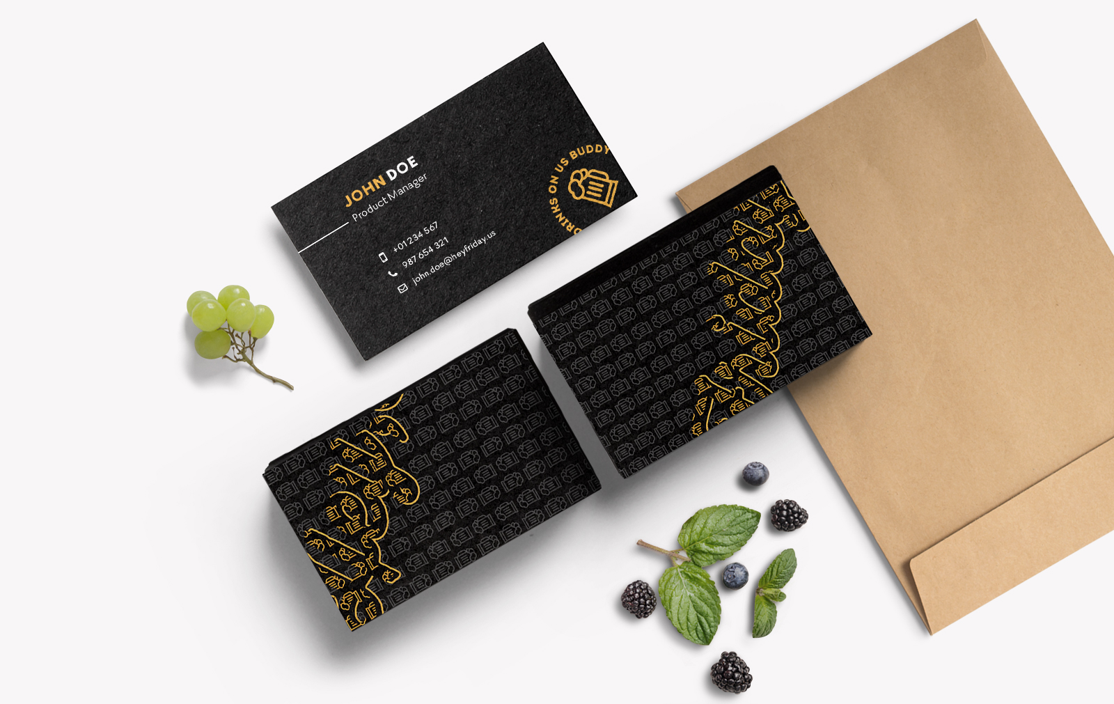
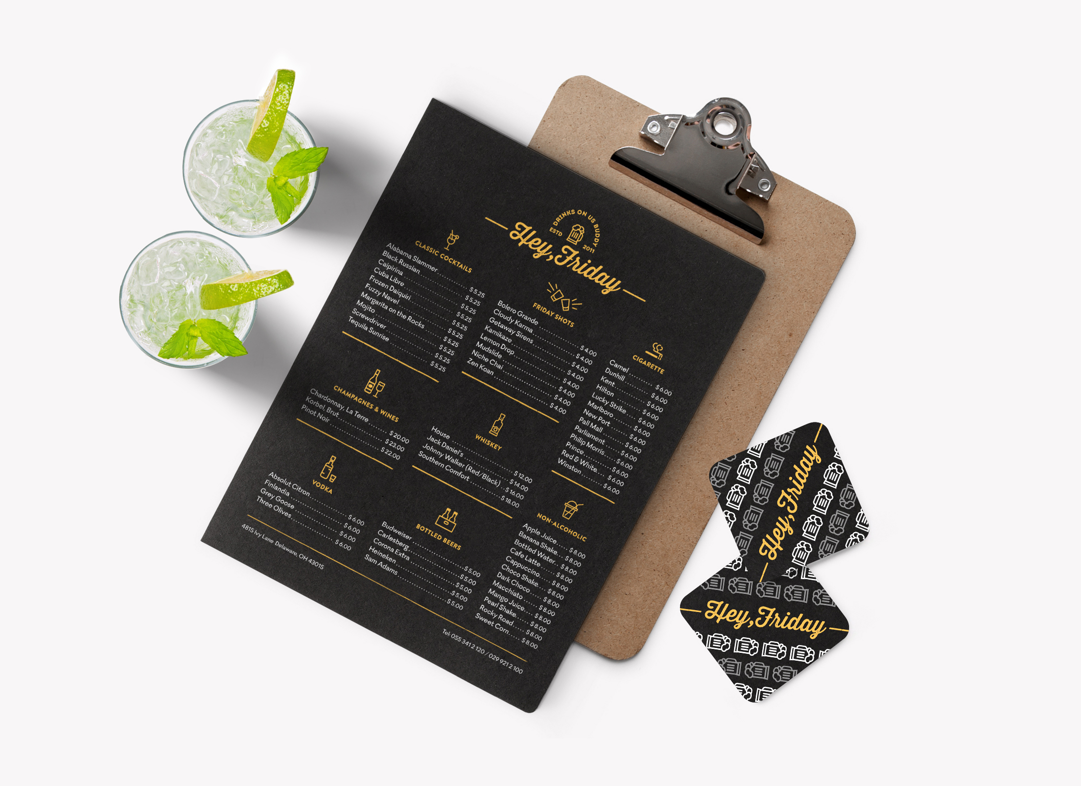
Art Direction: For the logo, I pushed through their ideal badge style but didn’t define its container by using the typical elements. Rather, I positioned it the way how a badge would look like. I added a subtle texture to give a vintage vibe to it. Main colors that were used are limited to two only, yellow and black — not too girly or boyish, while grey is a supporting color. For the eDM, I proposed a QR code inspired promo for a personal touch along with their names. To swerve away from the fancy visuals, I used icons to represent and support the texts.